Posted by: Dori 9 years ago
Colour trends for summer 2015
Written by: DORI team writer, Noemi S.
For summer 2015 there is a movement towards the cooler, softer colours of the spectrum. An eclectic, ethereal mix of light colours, pastels, and pale earthy tones are the focus of the season, and are preferred by designers. In the colour trends for summer 2015, simplicity is key!
As we approach the warmer months, we can observe that retro colours also make an appearance, marked by floral and folk prints. In addition, tropical landscapes will restore our sense of well-being, making us think of summer and holidays.
Nowadays, most people are constantly in a hurry, fearing that they will miss something important. This has created a need to escape everyday life, to create our quiet areas, to disconnect from technology and relax, and to give ourselves the required time to stop, and make time stop! Thus, colour trends for summer 2015 will follow this preference for minimalism. Cool colours and soft shades, with subtle warm tones enable escape from the madness and bustle of everyday life, a feeling that each of us want to experience.
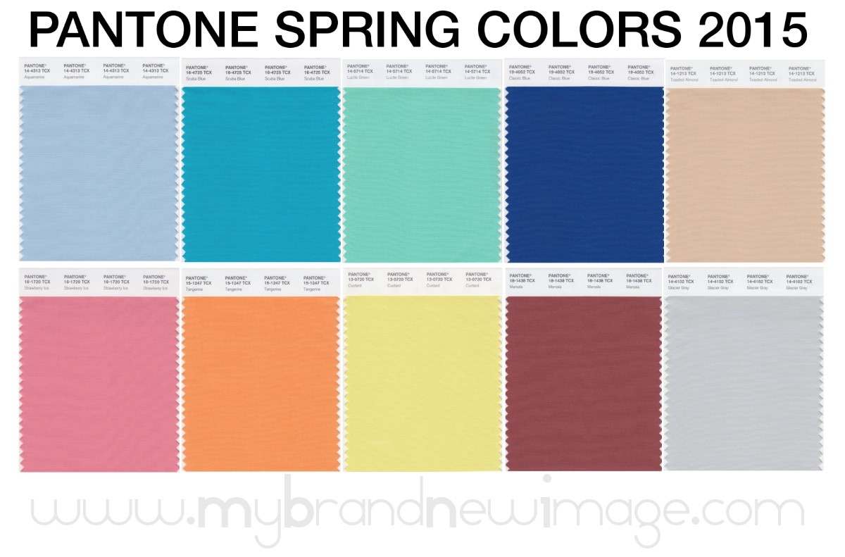
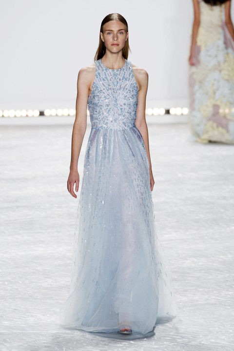
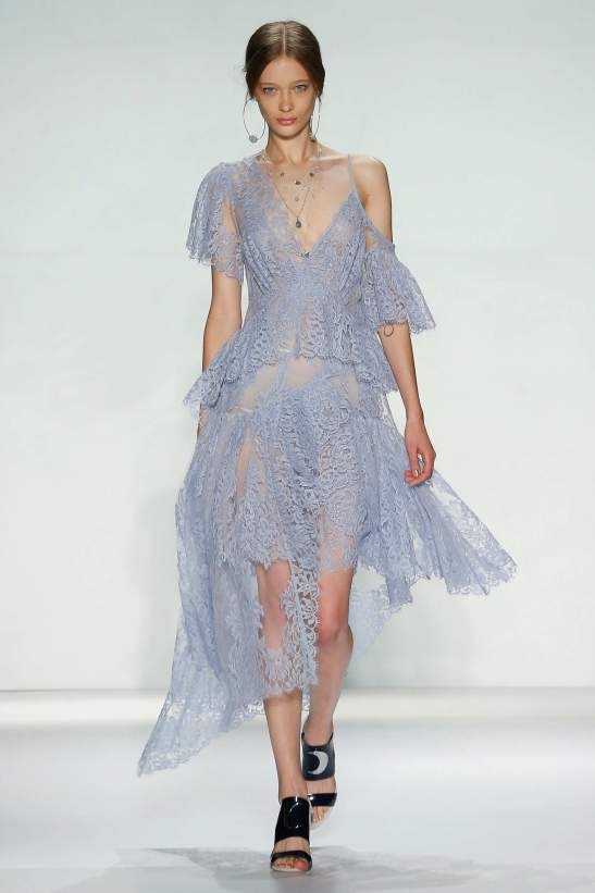
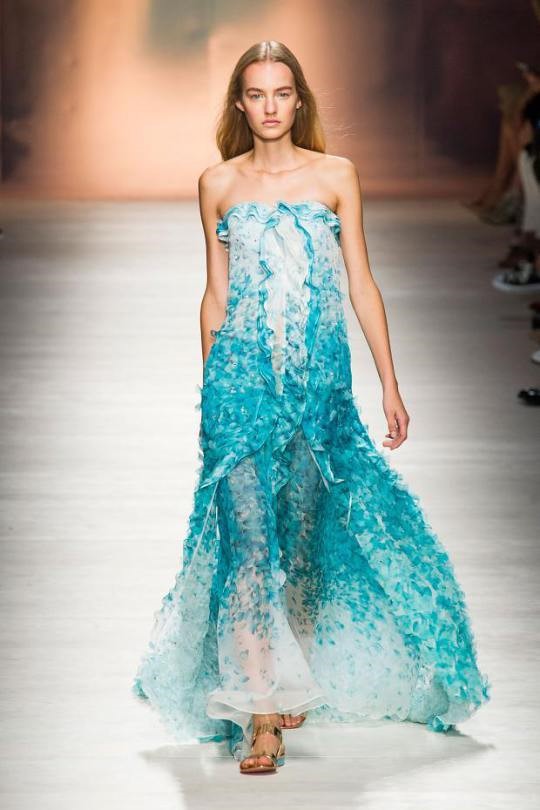
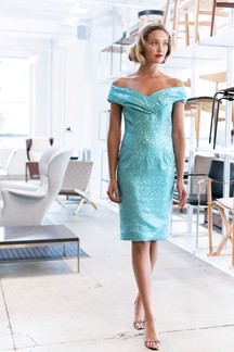
Aquamarine
Aquamarine is one of the colours we will wear a lot of this summer. This shade can be described as a blue that makes you dream, don't you think? A cool, calm colour, Aquamarine is a shade that makes you think of a trip to the sea, or a walk on the beach on a clear day. Open, expansive, this relaxing blue shade also acts against stress. You can combine this colour with Glacier Gray or Marsala.
http://shareenzahira.com/2014/09/30/fashion-new-york-fashion-week-favourites/
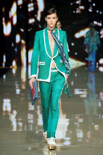
Scuba Blue
This refreshing turquoise conveys a childish, playful feeling, a carefree, stress-free time. Even if it's a cold tone, the vitality of Scuba Blue adds a splash of emotion to the colour trends of summer 2015. Scuba blue provides a sense of escape because it's reminiscent of a tropical ocean. The excitement and the energizing feeling of this colour make us think about an exotic paradise that is pleasant and inviting, even if it's just a fantasy. You can mix this colour with Classic Blue and Lucite Green.
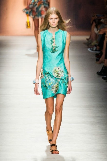
http://www.vogue.co.uk/fashio n/spring-summer-2015/ready-to-wear/barbara-tfank
http://fashionshow-w.blogspot.it/2014/09/blumarine-spring-summer-2015-2.html
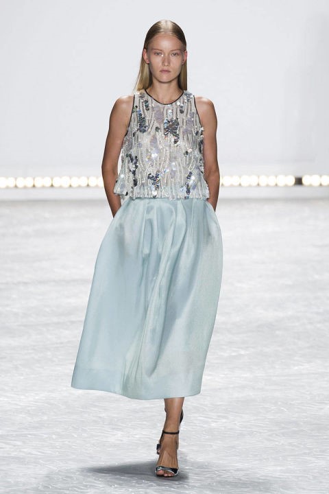
Lucite Green
Although this colour wasn't designed as a fashionable shade, it manages to return from time to time. Lucite Green is a soothing green hue whose time has indeed come again. A fresh, cold, but refreshing colour, Lucite Green has a special glow. Despite its brightness, this colour seems almost transparent. You can mix it with Classic Blue and Scuba Blue.
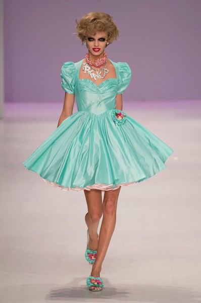
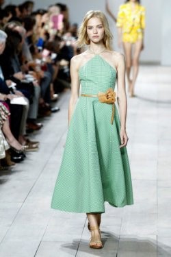
http://www.stylebistro.com/runway/Betsey+Johnson/New+York+Fashion+Week+Spring+2015/JiUbtxJORun
http://www.myprsite.com/top-searched-fashion-designers-on-yahoo/
Classic Blue
If I compared this colour with a persona, I would describe it as caring and dependable. Classic Blue inspires trust, calm and harmony. Serving as an anchor for the colour trends of summer 2015, Classic Blue is a strong and reliable shade. Like the sea, this blue is perceived as thoughtful and introspective. You can pair it with Sandstone and Marsala.
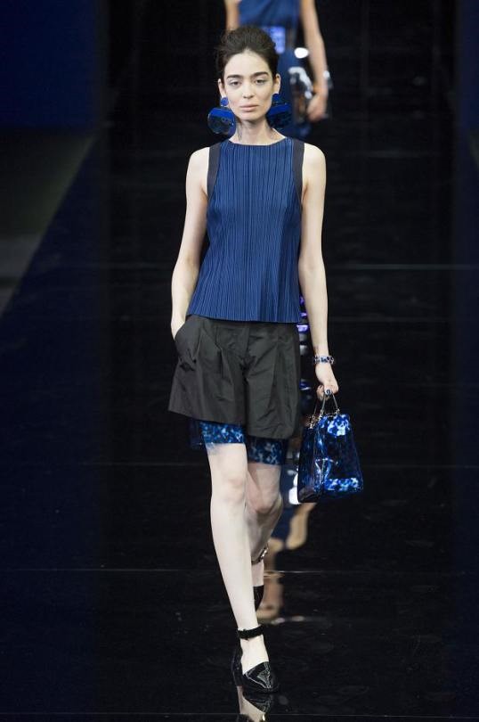
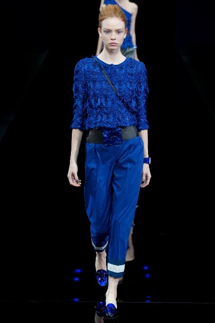
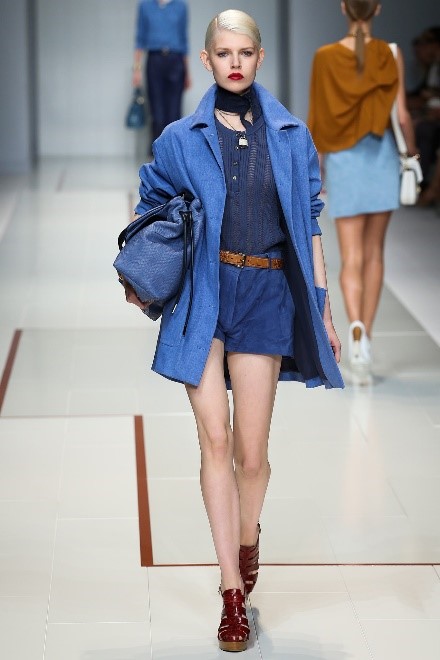
http://blog.nextmanagement.com/2014/09/18/emporio-armani-spring-2015-2/
http://blog.nextmanagement.com/2014/09/21/trussardi-spring-2015/#slideshow
Toasted Almond
This colour brings balance to the coolness of the summer 2015 colour palette. Toasted Almond is a neutral colour, tanned by the sun. It offers warmth, comfort and makes us think of the beach, fun, sand, giving us a feeling of summer. Timeless and versatile Toasted Almond is an organic shade that speaks of authenticity and all that is natural. You can match this colour with Lavender Herb.
http://shareenzahira.com/2014/09/30/fashion-new-york-fashion-week-favourites/
http://www.mindfood.com/gallery/new-york-fashion-week-springsummer-2015/
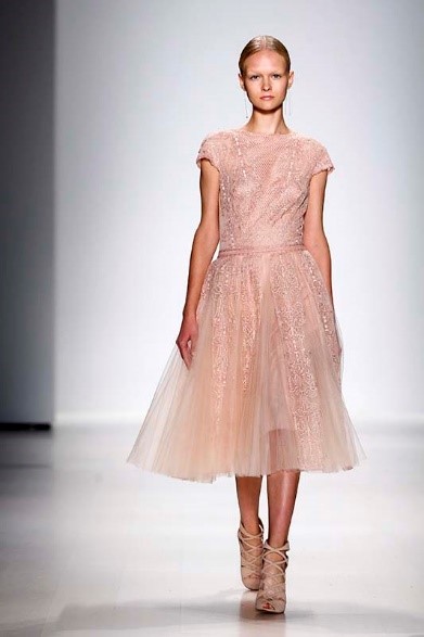
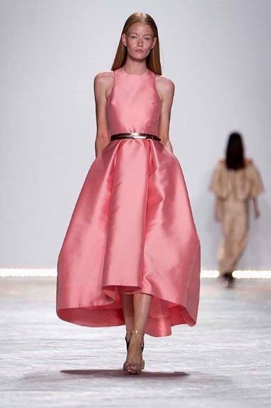
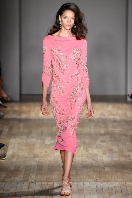
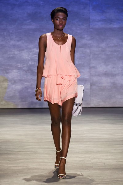
Strawberry Ice
The name "Strawberry Ice" suggests a delicate but invigorating colour that exudes a certain glow. This colour is attractive. Subtle and charming, Strawberry Ice is an ideal shade for summer 2015. Both tasty and tasteful, this colour brings to mind sweets and evokes a feeling of being "pink", giving a flattering, healthy glow. You can combine it with Toasted Almond and Tangerine.
 http://www.mindfood.com/gallery/new-york-fashion-week-springsummer-2015/
http://adayinmylife-rebecca.blogspot.it/2014/09/jenny-packham-rtw-spring-2015-nyfw.html
http://www.stylebistro.com/runway/New+York+Fashion+Week+Spring+2015/Rebecca+Minkoff/6rAYAPvb19-
Colour matching:
Now that you know the colour trends for summer 2015 here is a tip: be very careful how you mix & match them!
For a fashionista, colour matching is an art. The rules aren't as strict as they used to be: in the past, you had to match your bag to your shoes and the rest of your accessories, but now you only need to follow certain loose "rules".
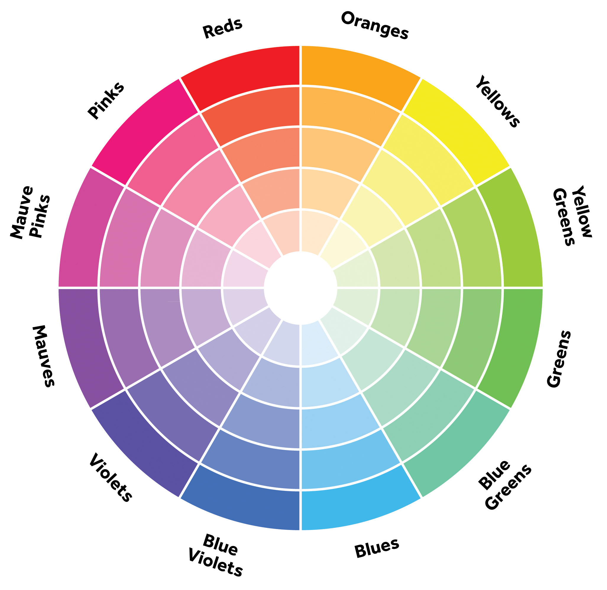
Primary Colours
Red, blue and yellow are known as primary colours. All other colours come as a combination of these three shades. Primary colours may look perfect in a monochromatc scheme, which mean to choose the same colour for each piece of clothing in your outfit in different shade of the same tone. The idea seems simple, but when done properly it can become modern and chic. Using a single colour lengthens and harmonizes your body.
If a monochrome look doesn't fit you and your style, and you want to be daring and stand out, you can mix all primary colours in a single outfit.
Complementary colours
Finding complementary colours is simple. Pick any colour from the colour circle: the complementary colour is the one on the opposite side of the circle.
Some complementary pairs: red and blue, purple and yellow, turquoise and brown.
Analogous colours
Analogous colours are even easier to find on the colour circle. Choose any colour on the circle, and then choose the colour next to it, on the right or left side on the palette. Shades that are similar to others in the chromatic circle create harmonious and balanced looks.
Accent colours
Now you are a professional at using the colour circle! You know how to combine a pair of yellow shoes with a navy blue shirt. However, in certain situations, you must have a conservative look. For example, no matter how nonconformist you may be and no matter how many crazy colour combinations you can create, your superiors at the bank or office might not be keen to embrace you new found colourful skills!
In these cases, choose a neutral colour, or a non-colour (black, white, cream, gray) and add a strong colour in the right place.
Enjoy the season, and have fun with colour!
Share on Twitter Share on Facebook
Comments
There are currently no comments
New Comment